We’re delighted to introduce the newest evolution of the Moon brand—one that honours our 187-year legacy while embracing the future with quiet confidence.
Since 1837, our name has been synonymous with Yorkshire craftsmanship, resilience, and innovation. This refresh is not a reinvention, but a natural progression—ensuring our identity reflects who we are today while staying true to our heritage.
Below, we explore the story behind the changes and what they mean for Moon’s future.
Celebrating Our Heritage
The story of Moon began in 1837 in Guiseley, West Yorkshire—a region steeped in England’s wool textile history. Here, our founder, Abraham Moon, began his journey supplying yarn to local weavers, before eventually erecting the mill in 1868. Its strategic position near the railway allowed our fabrics to travel across Britain and beyond.
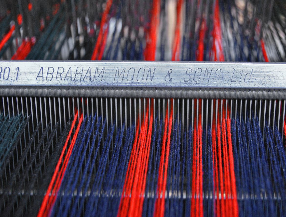
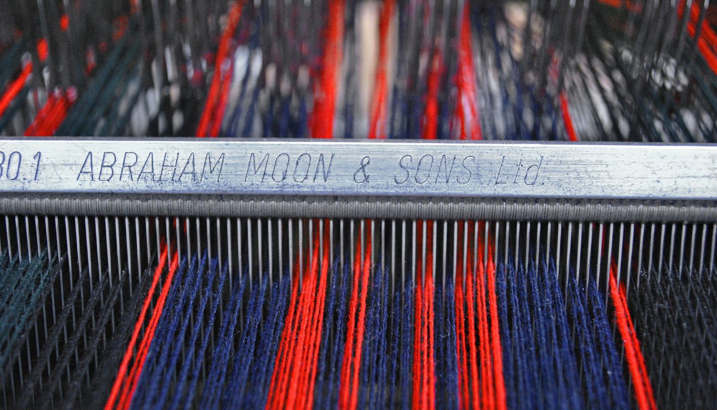
We’ve faced our share of challenges, like the fire that took out the original wooden interiors of our mill in 1902. Today, we remain one of Britain’s last fully vertical woollen mills, maintaining every stage of production—from raw fleece to finished fabric—under one roof.
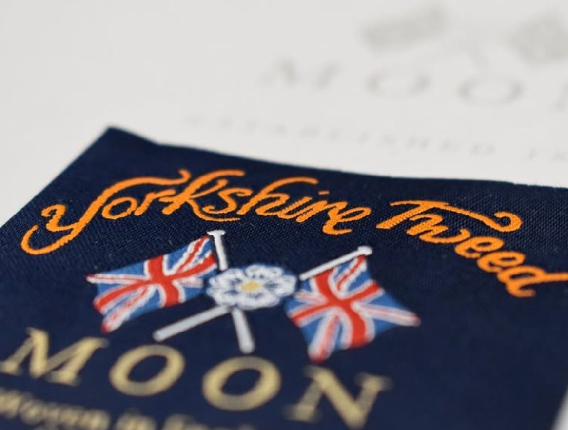
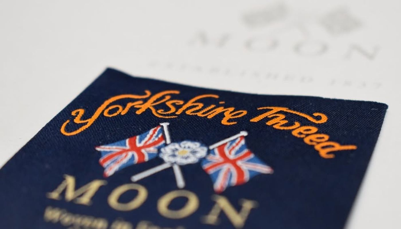
Our logo carries that same spirit. Introduced in the 1970s—when few Yorkshire mills branded their cloth—it was a bold statement of identity. Designed for woven labels on garments destined for France, it featured twin Union Jacks and the words ‘Yorkshire Tweed by Abraham Moon’. By 1980, this emblem had become synonymous with our craft, a hallmark we’ve continued to honour. As we evolve, this symbol retains its legacy while embracing subtle refinements.
Why it was Time to Refresh
While our foundations remain unchanged, the world around us evolves. This refresh ensures our identity aligns with Moon’s future—where tradition meets innovation in fabric design and sustainable practices. It’s not change for change’s sake, but a commitment to ensuring Moon remains as distinctive tomorrow as it has been for nearly two centuries.
Behind the Refresh
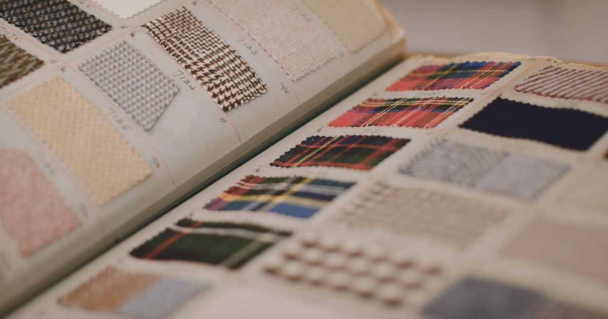
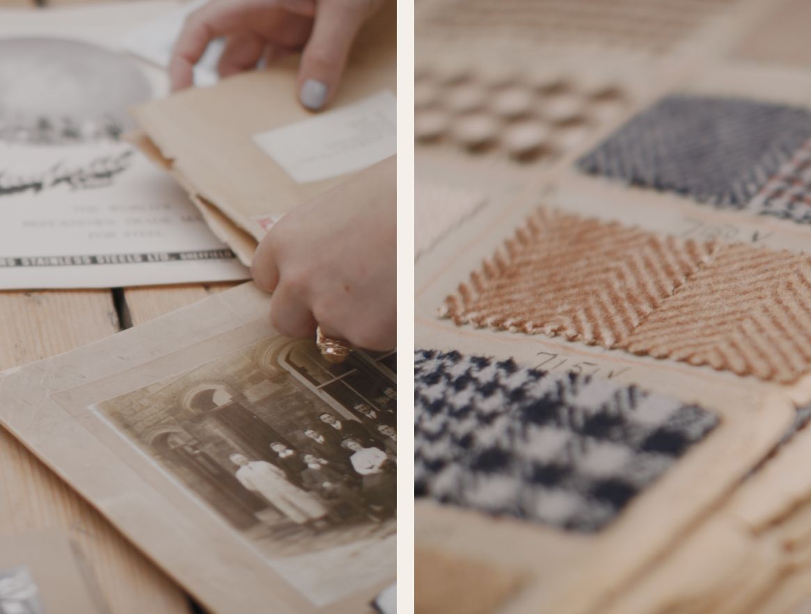
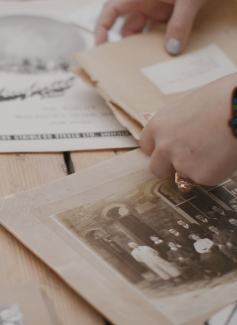
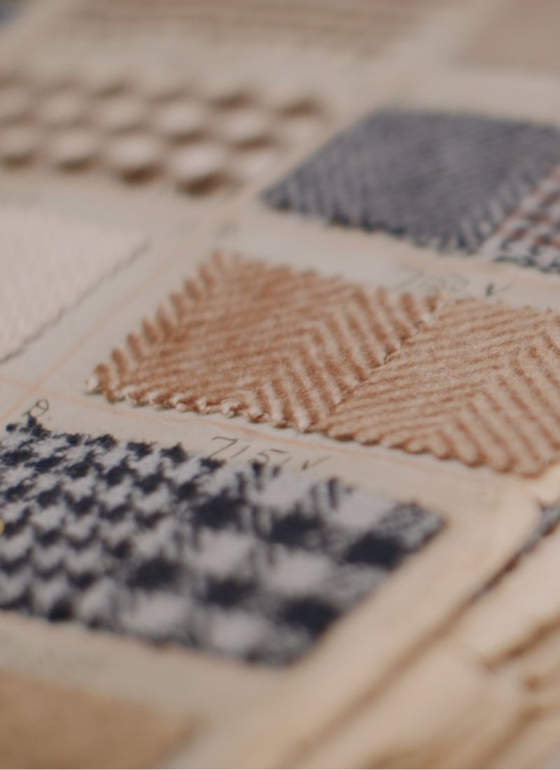
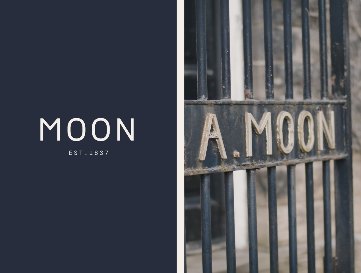
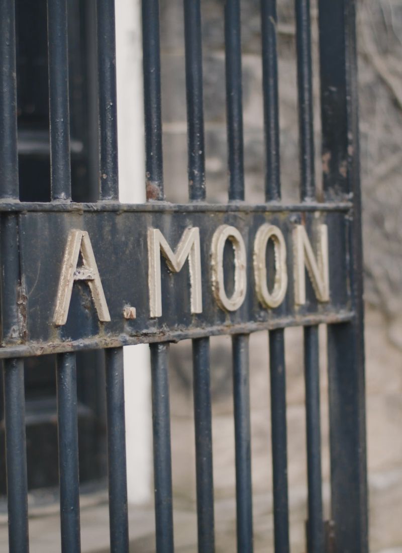
Inspiration came from the mill itself—the timeworn yet dignified motifs of its historic gate, the elegant lettering of archival ledgers, and the tactile beauty of wool passing through skilled hands daily. We’ve honoured these tangible connections while giving them space to evolve.
The refreshed logo draws from the mill’s heritage, incorporating subtle nods to its industrial past while ensuring clarity for modern applications.
Introducing Our New Brand Identity
At its heart, our emblem remains—the Union Jacks and Yorkshire rose still signify unwavering British craftsmanship. The evolution lives in thoughtful details:
• Typography: Classic styles are paired with clean, contemporary lines—mirroring our balance of tradition and progress.
• Colour: Dark Navy, Stone, Mushroom, and Rose Claret. Shades inspired by the mill’s history, refined for the modern eye.
The result is an identity that feels both familiar and fresh—true to who we’ve always been, yet ready for what comes next.
Looking Ahead to the Future of Moon
This evolution represents our commitment to thoughtful progress—to moving forward without losing sight of what makes us Abraham Moon.
The foundations remain unchanged: our Yorkshire mill, our craft traditions, our standards of quality. What evolves is how we express these values to the world—with clarity befitting our heritage and confidence for our future.
It’s the natural next step for a brand that has always been about more than fabric—about craft, character, and continuity.
